Author: Jenn

  • Find a Doctor Tool

    Find a Doctor Tool

    Role
    Lead Designer

    Team
    Engineering Manager, 1 Engineer, UX Manager

    Platform
    Desktop, Mobile

    Johns Hopkins Medicine

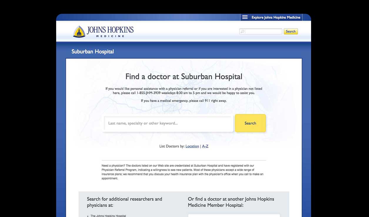
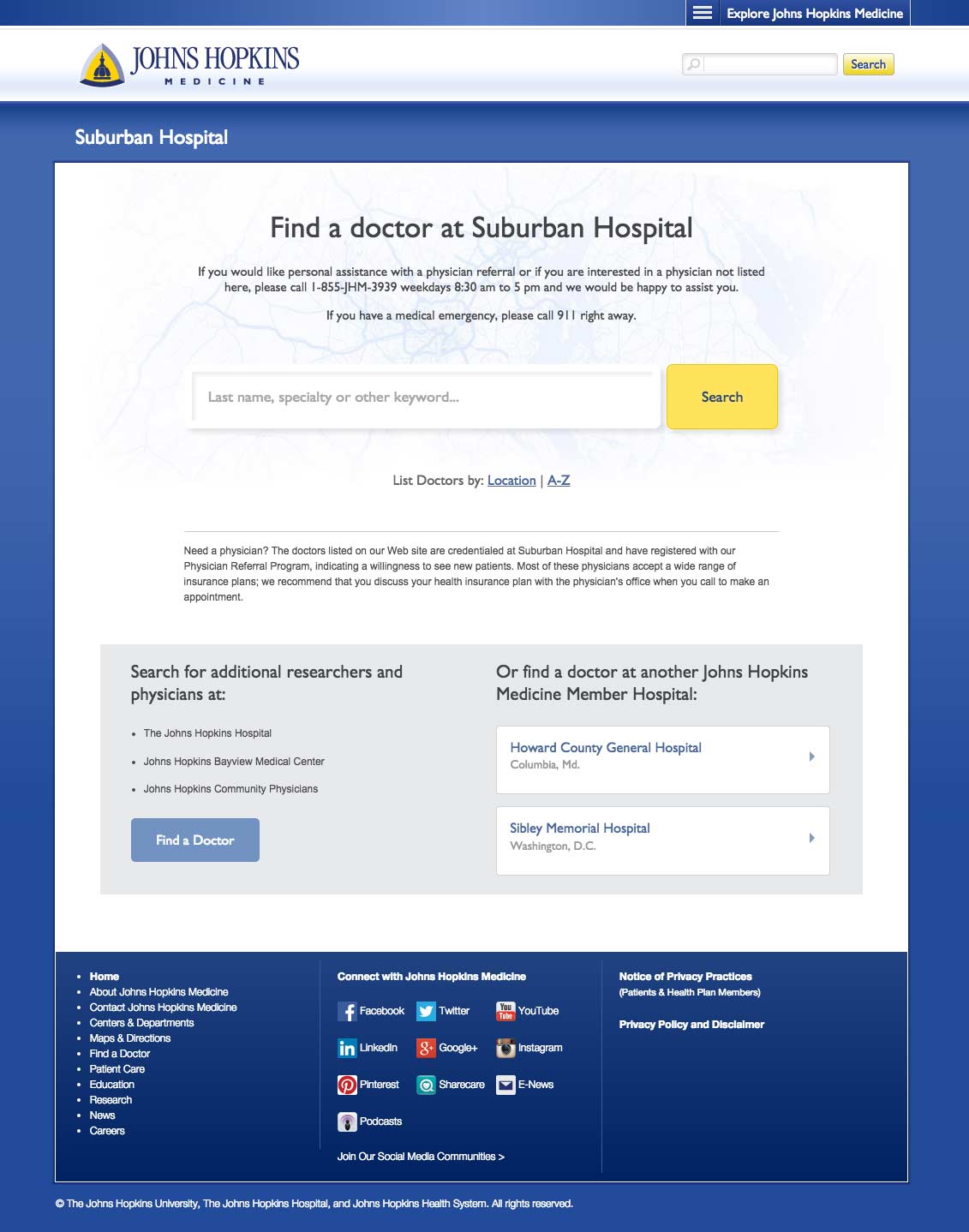
    The Find a Doctor tool offers patients advanced search options (e.g. location, specialty or keyword) and in-depth profiles.

    Objectives

    • Increase appointment bookings
    • Reduce friction for users who are overwhelmed by the options
    • Organize the doctor profiles to be more scannable and comprehensive.
    • Enhance the search results page.
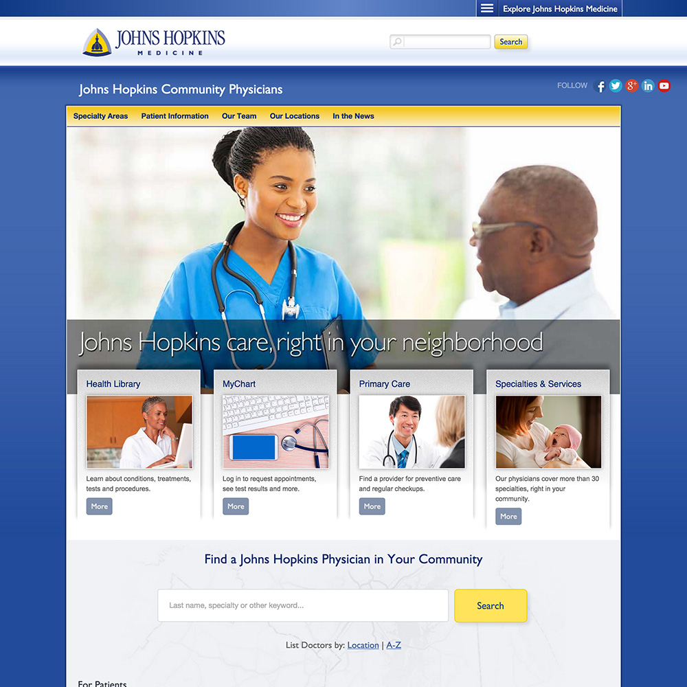
    Homepage

    Using our Foresee survey results we implemented a multi-layered solution that caters to the most common user profiles. Search was often the first step for users so we expanded it to search by keyword, specialty or name.

    Providing a lists for locations and A-Z accounted for the remaining users as well as offering links to the other hospitals under Johns Hopkins Medicine.
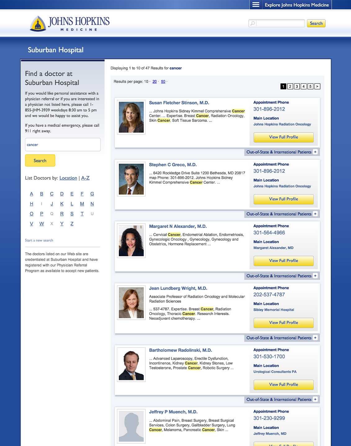
    Search Results

    We added the left sidebar pre-populated with their current search, allowing the user to refine if necessary. The search term was also highlighted within the result card profile snippets. Since booking an appointment is a pain point, we increased visibility for location and phone number by adding them to the result cards. Due to the high volume of out-of-state and international patients, I designed an expanding panel that included their specific contact information.
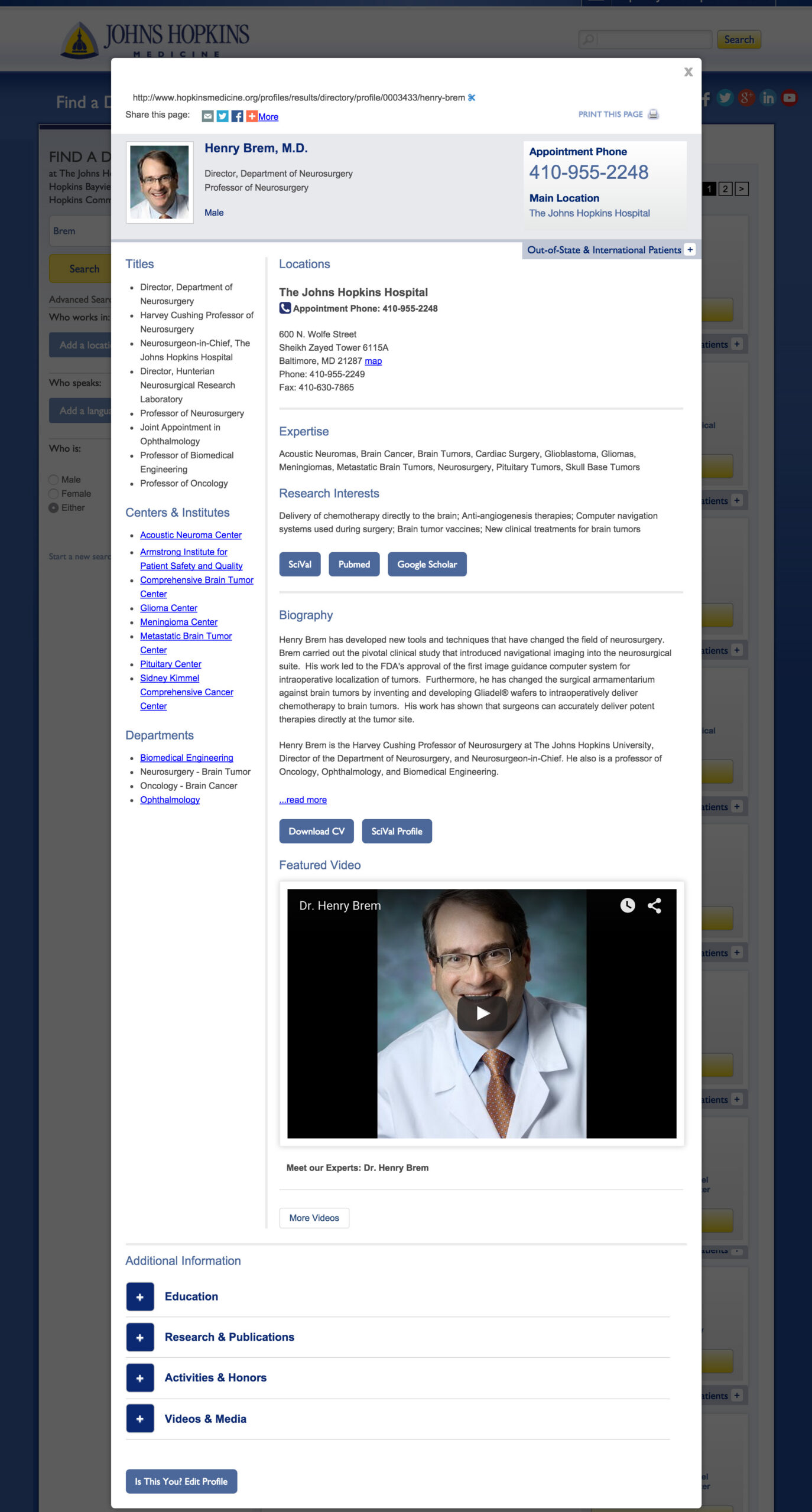
    Profiles

    With this update, I had to organize a lot of content with priority above the fold. The challenge was that the doctors didn’t always agree on what information was most important for the user. There were a few compromises, and overall, the profiles were well received by patients and caregivers.

  • Print to Digital

    Print to Digital

    Role
    Lead Designer

    Team
    Project manager, 1 Engineer, Editorial Manager, Editorial Art Director

    Platform
    Desktop, Mobile

    Johns Hopkins Medicine

    A well-loved print publication needed a digital version that was consistent in it’s content structure and bold, artistic imagery.

    Challenges

    • Create a user friendly admin for the editorial team to add their content.
    • Keep the artistic aesthetic of the print magazine.
    • The entire online experience should compliment the flow of the publication.

    Front-end

    The magazine had a bold color palette with strong frames and borders. I incorporated these elements throughout the design. I made the cover article the focus of the homepage to further showcase the impactful imagery from commissioned artists and photographers.

    The navigation followed the publication format for a cohesive experience.

    Winner

    Digital Health Awards

    GOLD / Hopkins Medicine Magazine (School of Medicine Alumni) / Division: Health System / Audience: Health Professionals / Classification: Digital Health Media / Publications. / Category: Magazine

    Additional Pub

    I also designed the digital version of the Dome, a magazine for staff of Johns Hopkins Medicine. This design also used the bold lines but I shifted to a softer color palette to differentiate between them.

    Winner

    Digital Health Awards

    MERIT / Dome (Staff Newsletter) / Division: Health System / Audience: Health Professionals / Classification: Digital Health Media / Publications. / Category: Newsletter

  • Dynamic Strategy

    Dynamic Strategy

    Role
    Lead Designer

    Team
    Project manager, 1 Engineer, Account Manager

    Platform
    Desktop, Mobile, CTV (Connected TV)

    I have been the designer for Shipt’s dynamic strategy for about 8 months. Our relationship with their agency has strengthened, enabling us to work efficiently while keeping the brand’s integrity at the forefront and delivering stronger outcomes.

    Product Feed Template

    Shipt wanted to run local, in-stock product ads to the right in-market audiences. Using legacy tools this would have required a costly and consuming 1.2 million unique creatives.

    The evergreen template was designed for running throughout the year in between seasonal promotions. I created two variations: single retailer and multi-retailer (displaying up to 5). When multi-retailers were listed, the CTA would show the logo for the retailer offering the product.

    Summer Template

    The summer template was requested based on some brand changes for the season as well as dynamic changes to the creative based on pre-determined themes. The headline, bag images and savings stickers were updated for the frequent promotions.

    World Cup

    • Promoting Shipt Kits for World Cup fans
    • Include a countdown leading up to the next US game then switch to live
    • Adapted client provided creative to include a custom countdown and game details

  • Tech Event Collateral

    Tech Event Collateral

    Role
    Lead Designer

    Team
    Project manager, 2 designers

    Platform
    Print

    Since the conference was held in San Francisco, the Golden Gate Bridge was the focal point and inspiration for the illustration. Creating a vector illustration was key for scalability across the event.

    The design was then incorporated into signage throughout the convention, including hanging and standing banners, the stage backdrop, large-format checks presented to winners, table signs, and the program.

  • Travel Planning Tool

    Travel Planning Tool

    Role
    Lead Designer

    Team
    Project manager, 1 engineer, Account Manager

    Platform
    Mobile

    A custom mobile ad experience providing personalized destination recommendations based on consumer passion points and travel interests.

    Campaign Objectives

    • Increase brand awareness
    • Attract new customers
    • Drive bookings with increased efficiency and return on investment

    Solution

    The tool leveraged user location data to deliver a highly personalized experience that guided travelers toward drivable destinations matched to their specific activity interests.

  • Upload Tool Redesign

    Upload Tool Redesign


    Role

    Lead Product Designer

    Team
    Project manager, 2 engineers, Director of Engineering

    Platform
    Web

    Yahoo’s uploader tool provides editorial and advertising teams access to a CDN for hosting assets across the ecosystem. Most commonly these assets are used in Yahoo property content (News, Sports, Finance, etc) as well the company intranet.

    The Problem

    The tool provided a basic solution for the user. They could upload their assets and transcode their videos but this often required more steps than necessary. Additional tools were necessary to crop images before the upload process. There was also confusion as to how a CDN worked resulting in frequent question fielding by engineers.

    Research methods used:

    • Survey feedback from power users
    • Brainstorm with engineering to discover their pain points and listen to ideas
    • Analytics review

    Key Findings

    Finding #1

    Overall user flow needed improvement.

    Finding #2

    Incorporate internal tool for cropping so users don’t need to prep their image asset externally.

    In the case of multiple image uploads, a gallery will provide the opportunity to crop before saving.

    Adding a couple options to the Actions made the list too long. I moved them into a drop down to allow for labels and to save space.

    Opening the preview modal allows the user to access the other tools/options as well.

    Users can choose to crop at this stage.

    Finding #3

    Add preview and transcode features in the video upload step.

    Finding #4

    Add an activity stream for troubleshooting user issues

    Finding #5

    There is general confusion on what a CDN is so we added an FAQ

    Updated design elements

    Error messages
    Alert bars
    Loading animation

    Tradeoffs

    When the user opens the tool, it loads with the most recent uploads within the entire company. I offered a recommendation to allow for team based directories for privacy and easier file navigation. Since that was not possible due to the current setup and time constraints adjusted designs to add a directory/folder bookmark feature.

    Solution

    The final prototype incorporated a streamlined user flow, reducing clicks by 40%. Tooltips, error messages and progress animations were added for user feedback. The new features allow the user to crop their images either right after upload or later. The video transcode was enhanced by including a video preview at upload.

  • Beer Label

    Beer Label

    Role
    Lead Designer/Illustrator

    Team
    Project Manager

    Platform
    Print, Packaging

    Designing for a cylindrical surface presented its own unique set of layout considerations, requiring the composition to flow naturally around the can while remaining visually impactful from every angle.

  • Custom Illustrated Logos

    Custom Illustrated Logos

    Role
    Lead Designer/Illustrator

    Team
    Project manager

    Platform
    Print

    Hand drawn illustrations for logo, including a skillet tossing vegetables and the bottom images is a pile of vegetables resting above Chef Seth Jonas type.
    An animated gif of the drawing timelapse from Procreate.

    A personal chef company wanted a logo that balanced quirky charm with polished professionalism. After multiple rounds of hand-drawn illustrations, we found the right blend.

    Primary logo on white, cream and gray backgrounds.
    Primary logo on black, brown and dark green backgrounds.

    The client responded well to the concept of a flexible logo system, so I designed both a primary and a secondary logo to provide versatility across different applications. Simplified icon versions were included to retain the brand’s character at smaller scales or in contexts requiring a cleaner mark. The result was a cohesive identity that could adapt to everything from packaging to digital without losing its personality.

    Secondary logo, icon sized on white and black logos.
    Secondary logo full size on white and black.

  • Workshop Branding

    Workshop Branding

    Role
    Lead Designer

    Team
    Project manager, 1 designer

    Platform
    Print

    The Wolfpack Endeavor needed a logo that combined their wolfhead icon, book logotype, and the Endeavor name. This wasn’t very challenging since the branding was already strong.

    I took the branding even further in the workshop experience guide. Incorporating the book cover aesthetic and the program’s spirit resulted in a bold and unique printed guide. The goal was to ensure the guide felt like a natural extension of the brand while reflecting the Endeavor program’s energy to empower women.

  • Xbox Landing Experience

    Xbox Landing Experience

    Role
    Lead Designer

    Team
    Project manager, 1 Developer, Account Director

    Platform
    Xbox

    Xbox Homepage with Banner Ad to LE on the bottom right

    I introduced motion to the design by animating paint-swipe elements sourced from the client’s asset pack. These animated textures added depth and energy to the experience. The result was approved by the client with very minimal changes, demonstrating that the creative choices aligned closely with their vision even without explicit upfront direction.